
How Design Strategy Helped Blend Land Navy Federal Credit Union

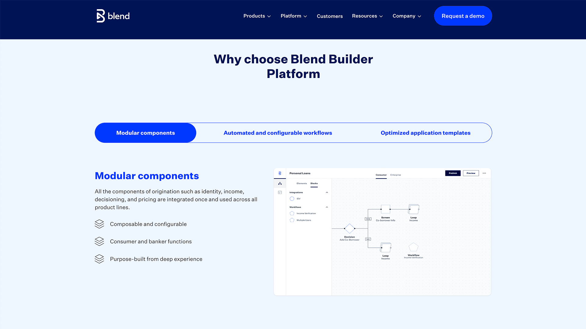
An image from Blend's web site
TLDR;
I built and led the design team responsible for the Blend Builder Platform — a low-code tool that enables banks to launch financial products in months instead of years. My design strategy directly contributed to securing Navy Federal Credit Union as a customer, expected to generate 2M+ annual transactions. During my tenure, the platform grew from 1M to 3M annual transactions.
During my tenure, the Consumer Banking Suite — heavily powered by the Builder Platform — saw 22% revenue growth year-over-year. The user experience updates created by my team played a crucial role in securing a deal with Navy Federal Credit Union, which is expected to generate over 2 million transactions per year, each contributing to Blend’s revenue. At the time the deal was made, the Blend Builder Platform was processing approximately 1 million transactions per year.
$30M
Quarterly Revenue
$22%
Year Over Year Growth
3M
Annual Transactions
Situation
When I joined Blend, the Builder Platform had a significant adoption problem — only Blend's internal professional services team could use it. The vision was to open it directly to bank customers, but the immediate mandate was clear: make the platform usable and compelling enough to drive adoption and grow revenue. I was brought in to lead the design effort that would get us there.

A slide taken from one of Blend’s earnings calls.
Task
My task was to develop and execute a design strategy that would make the Builder Platform significantly more usable — one that could influence the product roadmap, align cross-functional teams, and ultimately drive measurable business outcomes
Grounded in company and business goals from the start, the strategy translated priorities into a clear design direction, secured cross-functional buy-in to get projects on the roadmap, and guided the team through execution to launch — as illustrated in the strategy map below.

An illustration of my strategic approach
Activities
Identify and Document Users
To anchor the strategy in real user needs, I met with product managers, shadowed customer support and engineering teams, and conducted a heuristic evaluation of the platform as a first-time user. This surfaced two distinct archetypes: technical and non-technical users — each struggling with code-centric elements and craving a more hierarchical interface. These two insights became the foundation of the entire design strategy. Key sentiments from the sessions included:
The desire for a clearer, more hierarchical interface
Hope for an easier way to work with the data
A need to spend less time hacking the data model

The technical user proto-persona I created

The non-technical proto-persona I created
Get Projects on the Roadmap
With a clear strategy in place, I worked across design, product, and engineering to get targeted projects onto the roadmap — each one aimed at reducing the technical overhead users faced when building with the platform. Securing cross-functional alignment on these priorities was as important as the design work itself.

Projects I championed onto the roadmap
A Sample of Projects Built from the Strategy
Connect the Front-End to the Back-End in a Simplified Manner
A persistent pain point for users was connecting UI elements to the data powering the backend — a technically complex task that created friction for both technical and non-technical users alike. I guided my team to reframe this as a UI problem rather than a code problem, coaching them toward a more contextual approach that let users make data connections directly within the interface. I reviewed and tested the work iteratively throughout, and contributed hands-on design work myself — which I'll detail later in this case study.
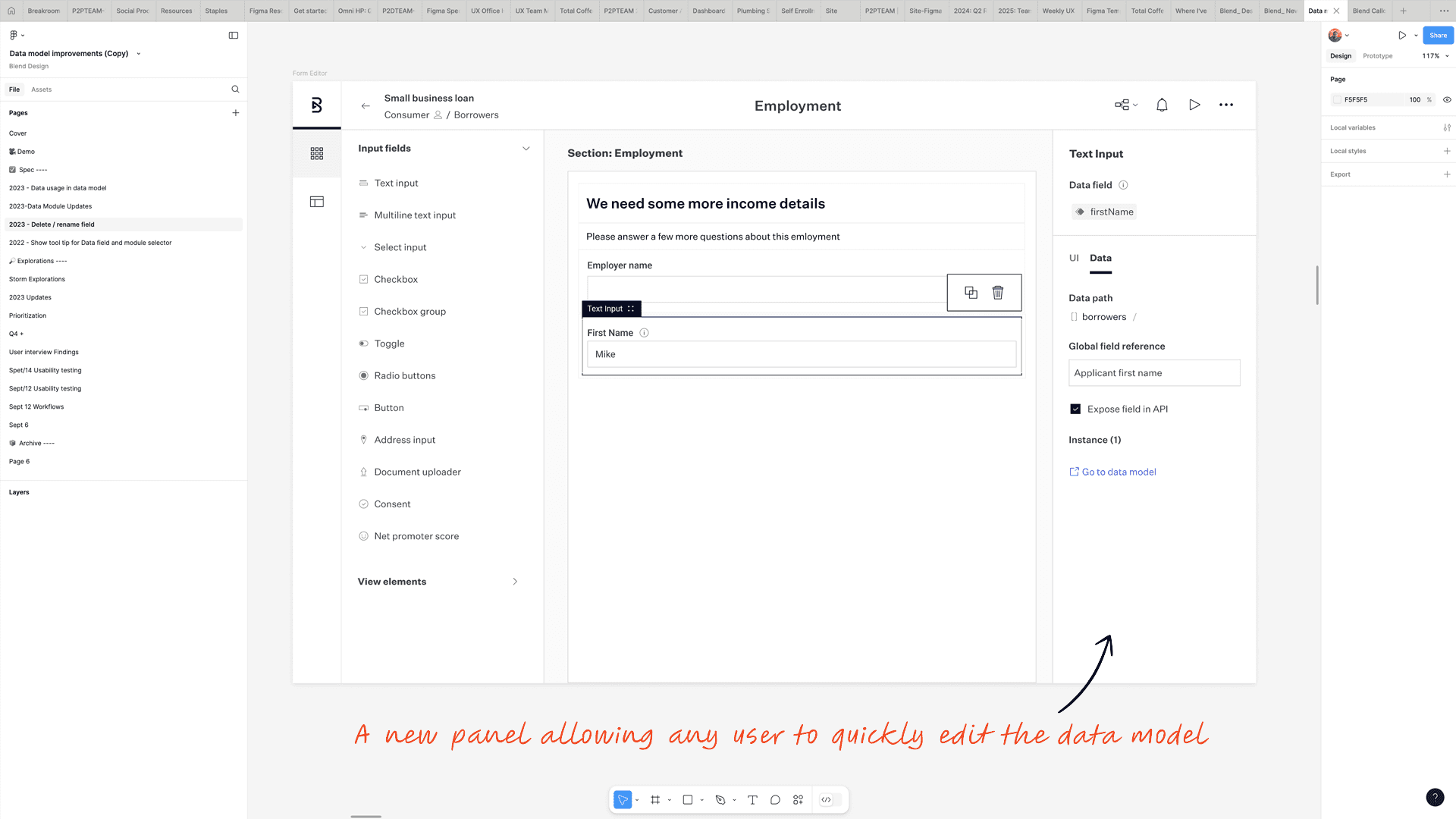
Users can now edit the data model directly within the builder interface, without switching contexts.
Simplify Editing the Data Directly
The notion of being able to toggle back and forth between the front end and the back end view was introduced. This allows for a more seamless handoff between the technical and non-technical users to allow for direct editing of the data, which was required of every project to ensure the products being built took advantage of Blend’s regulatory-compliant APIs, as well as those belonging to our customers.
Now any user could edit the data model.

Giving users the option to toggle between regular and advanced editing
Another key challenge was the disconnect between the front-end and back-end views — a gap that created friction for both technical and non-technical users and complicated every project build. Working closely with my team, I helped them think through an experience that allowed users to toggle seamlessly between views, enabling direct data editing without losing context. This was critical: every product built on the platform needed to leverage Blend's regulatory-compliant APIs, and this feature made that accessible to non-technical users for the first time.
We took this further by solving a related problem — helping users understand where data was used throughout an application. In a product like our Instant Home Equity offering, which contained 2,600 nodes (individual configurable elements within the platform), finding every instance of a data object was nearly impossible. I coached the team through designing a solution that made every data instance findable and navigable.

Surfacing every instance of data across an application — making the invisible visible for users.
Enabling Copying and Pasting
Copy and paste had been a long-standing pain point for users, but it was deceptively complex to solve. When a designer I had been collaborating with closely left mid-project, I stepped in and took ownership of the work while we backfilled her position — carrying the concepts we had developed together through to completion.
The core technical challenge was understanding what happened when copied nodes had dependencies on other nodes that weren't part of the selection. This could cause cascading errors that were difficult for users to anticipate or resolve. I worked extensively with the lead engineer to fully understand these edge cases, and that collaboration directly shaped the design decisions — particularly around how to surface data mapping issues clearly to users before they became problems.
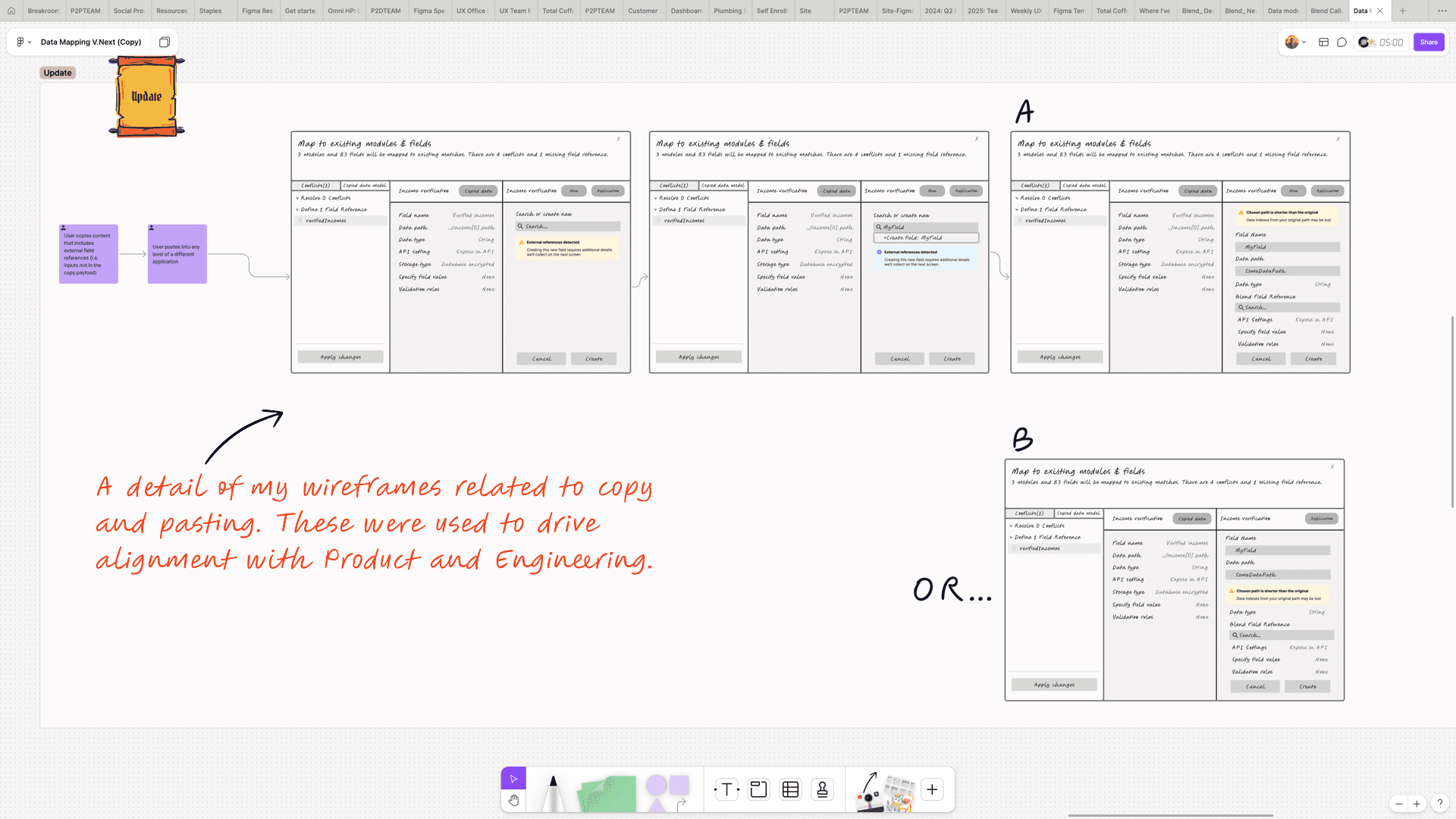
Early wireframes mapping the copy and paste logic and its edge cases.

The final UI, designed to surface data mapping issues before they cause errors.
Evolving the Design System for Scale
Alongside the feature work my team was delivering, I was leading the evolution of the Builder Platform's design system — establishing the component library and visual language that would allow the platform to grow without fragmenting.
The node system was central to this effort. Each node type — Form, Integration, Decision, Loop, Review, Email, Block, and Group — required its own distinct visual identity and interaction model, while remaining coherent as a family. Someone building a banking workflow needed to understand at a glance what each node did and how they connected. Getting that right required careful decisions about shape, hierarchy, and the context menus that surfaced different actions depending on the node type.
The broader impact extended beyond the Builder Platform itself. By aligning the design system across both the Builder Platform and Blend's Consumer Banking Suite, my team created the connective tissue that allowed both products to scale together. That alignment played a direct role in the Consumer Banking Suite's 22% year-over-year revenue growth — and in giving Blend the product coherence that made the Navy Federal Credit Union deal possible.

The Builder Platform node system — the visual language enabling banks to assemble complex financial product workflows with significantly less code
Results
The design strategy delivered measurable results. Blend secured a deal with Navy Federal Credit Union — the largest credit union in the country with over 10 million members — to use the Builder Platform to verify membership and create deposit accounts, projected to generate 2 million transactions annually.
Beyond the Navy Federal deal, my team's design systems work played a direct role in connecting the Builder Platform to Blend's Consumer Banking Suite — contributing to the Suite's 22% year-over-year revenue growth.
The Blend Builder continues to power the experiences banks use to provide products and services to their customers to this day.

Blend’s press release about the Navy Federal Credit Union deal
To this day the Blend Builder continues to power the experiences banks use to provide products and services to their customers, as shown in one of Blend’s quarterly earnings presentations.
